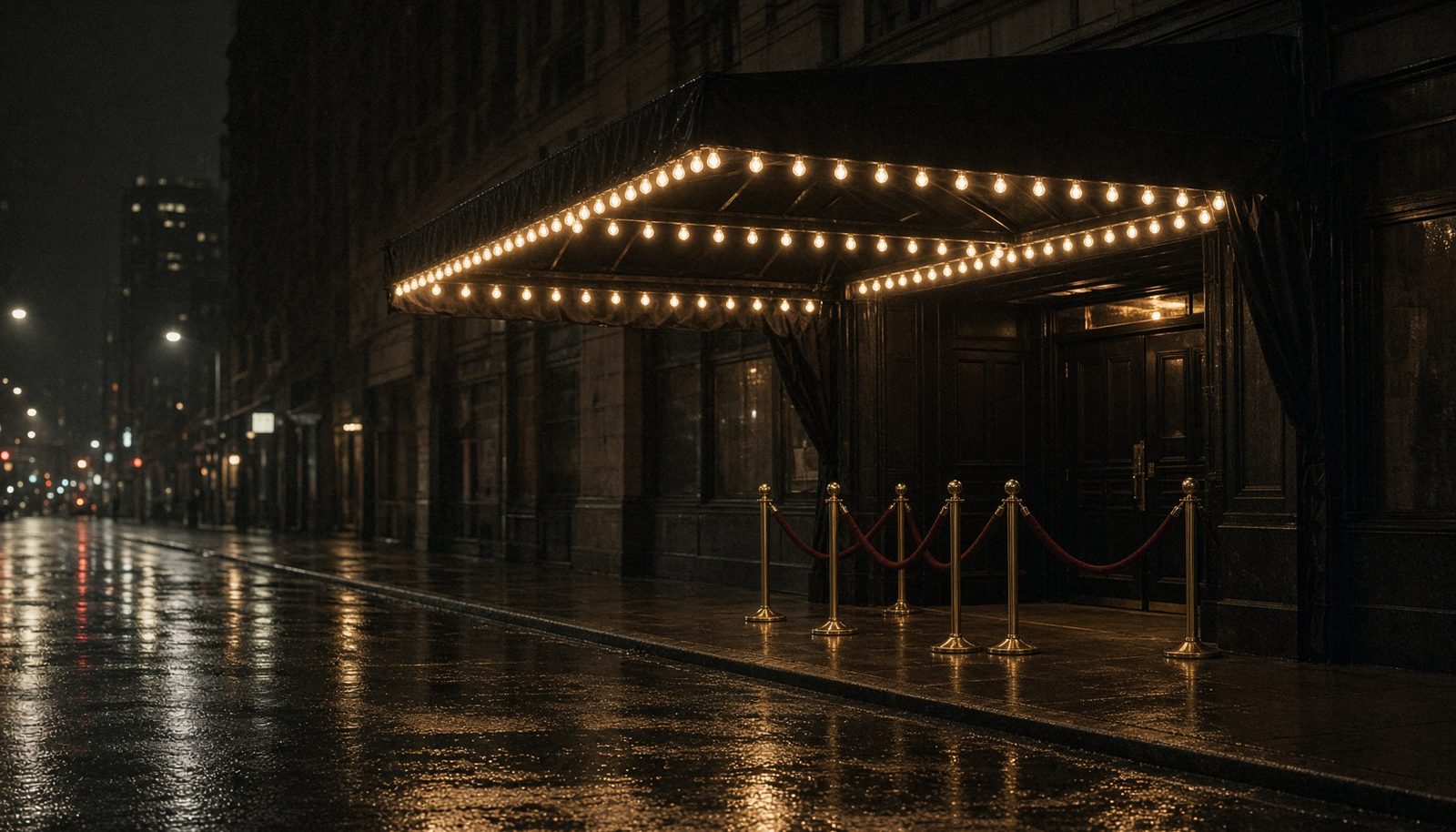
West 54th Street
1977
Tonight only
54
GRAND OPENING
Display typeface · 2009 · Shin Oka
Extra-bold geometric display drawn after the Studio 54 mark. Unicase caps, seven ligatures, and a second cut hiding in the lowercase.
West 54th Street
1977
Tonight only
54
GRAND OPENING

01 — Tester
Type lowercase a b m o p r v w x y to reach the second cut. Ligatures fire on CA CO GA HT NT TH UT.
8 characters · Extra Bold 800
02 — Sizes
GRAND OPENING TONIGHT
GRAND OPENING TONIGHT
GRAND OPENING TONIGHT
GRAND OPENING TONIGHT
GRAND OPENING TONIGHT
GRAND OPENING TONIGHT
GRAND OPENING TONIGHT
03 — OpenType
Standard ligatures
CA
CA
CAFE
CO
CO
COAST
GA
GA
GATE
HT
HT
NIGHT
NT
NT
COUNT
TH
TH
THE
UT
UT
CUT
Stylistic alternates
Ten letters carry a second drawing. Type the lowercase, or toggle Alternates. Zero has a second form through the aalt feature.
A / a
B / b
M / m
O / o
P / p
R / r
V / v
W / w
X / x
Y / y
0 / aalt
04 — Character set
Tap a cell to copy.
Inspector
A
05 — In use
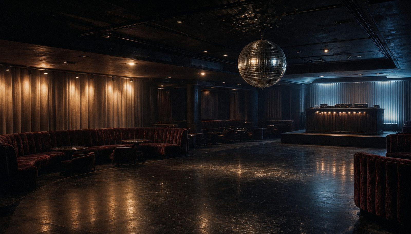
Tonight only
West 54th
STUDIO
54
Issue 12 · Spring
THE LAST
DANCE
Admit one
Row C · Seat 54
NIGHT
FEVER
Final
54
—
21
HOME · AWAY
Figures
0123456789
06 — Notes
Shin Oka drew Fifty Four in 2009, taking the nightclub's famous mark as a starting point: a geometric extra-bold with a five that reads like a reversed S, a triangular Y, and joins tight enough for a door card.
Daylight Fonts released it in March 2020 as a personal-use face, with the revivalist's usual care — ligatures for the phototype combinations (CA, CO, GA, HT, NT, TH, UT) and a second cut stored in the lowercase slots.
It is a display alphabet, not a text face. Set it large. Let the five do the talking.